ShopDreamUp AI ArtDreamUp
Deviation Actions


Description
More progress...
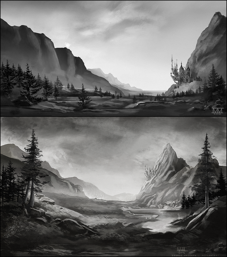
Bierstadt study with Equestria landscapes.
Going to add color next.
The clouds are going to be the hardest part... UGH.
CS6.
Bierstadt study with Equestria landscapes.
Going to add color next.
The clouds are going to be the hardest part... UGH.
CS6.
Image size
900x1019px 1.18 MB
© 2012 - 2024 CosmicUnicorn
Comments49
Join the community to add your comment. Already a deviant? Log In
I'm going to be honest with you. I thought I was looking at a picture at first. I know that you've heard that before already, but it's true. You just did it that well. It wasn't until I looked at it closer that I realized that it was a drawing. A sketch. A black and white rendition of a scene that I see often. And, oh is it gorgeous. I think that I might be in love with this image, honestly.
That's not to say that I don't have problems with it. I do. But every relationship has its ups and downs. This one is no exception. I don't know what you were going for on these images, but I'm getting quite distinctly an early morning view of it.
That's not a bad thing. Early mornings are almost as good as the night for me, so that's a plus. It really took a while for me to find something to say about your image, because I do love it, but there was something that I couldn't bring myself to like about it.
The top image has a blank back beyond Canterlot. You have a few mountains over to the left, but then they taper off and disappear, but instead of replacing it with something, you just let it sit there with nothing. What is that? Are you suddenly sitting on an ocean? The desert? Maybe it will make more sense with color, but in a sketch, it's just blank canvas. A polar bear in a blizzard.
I also don't care for the positioning of Canterlot being near the base of the mountain. There's just something fundamentally wrong about a city being on a mountain, but being at the base. The architecture just isn't fundamentally sound unless it's placed inside the mountain, which it isn't. This city was built on the surface of the mountain and expands outward from there.
As you can probably tell by now, it's the top image that I really don't like. I don't have anything really critical to say on the bottom image except that I can't really see the city, so the name of the picture is a little misleading. It's more about the landscape surrounding Canterlot than the actual city that is Canterlot. I suppose that saying that the picture is Canterlot is much easier and more appealing than saying "Canterlot's Environment" or something of that nature, but there you have it.
I also wonder about the connection of these two pictures. Is one a distant view and the other a closeup? If that's the case, then once again, I bring in the perspective of the positioning of Canterlot. One has the city in the center of the mountain, actually appearing to be set into the side of it, while the other has it at the base. So excuse my inability to understand it.
Okay, I think that I've done enough bad mouthing for now. Despite everything that I've said, I still really love this image. It's extremely detailed and has a significant imagery about it. It really creates a sort of emotion about it, I guess. Which is good for an image. You want your art to invoke emotions in the viewers so that they don't just look at something and go, "Meh, it looks great, but I don't really get anything from it." Even a negative emotion like depression is better than no emotion at all. And, my friend, you have created emotion. It's a wonder and a beauty. Some of the thing in it don't make sense, but I still love the image that it creates.
SO!
Vision: It's great. You can really see what you're doing, but you haven't quite finished drawing it. Unless you actually explain the sketch a bit, there are things here that just don't make sense that rely on the viewers imagination to have an individual perspective on it. That's not always a good thing. You're going to have ignorant viewers that just can't see the point, but despite that, those who can see what it is, can really see it.
Originality: No. Despite the content of the picture being mostly the area surrounding the capital of Equestria, you still advertise is as being Canterlot, so that really detracts from you. I still give you credit for having a unique view of the city. And the fact that your focus isn't the city itself makes this piece actually in its own right a masterpiece.
Technique: You have it. There's detail in the picture and a unique aspect. There's few, if any mistakes in the drawing that can't be attributed to the actual style of the drawing.
Impact: As I said, this hit me as if it were a picture. It's that detailed and appealing. You hit me with emotion as well. This is a well done picture. For me, impact is the most important thing. You hit me good, but I merely went to the floor. I feel wonder and beauty, but there's still the overcast day and kind of gives it a contrast of dark and gloomy. Maybe when you put it into color the contrast will disappear and the full impact will there.
I eagerly await the completed work.